The Worst Film Posters of All Time – 2009 Update
During our Worst Film Week event a year ago, we posted a list of the film posters considered to be among the worst of all time. Well, time has passed since then, and we’ve got a little update on those cinematic poster flops. the idea of a film poster is to invite people to see your film. Be it horror, comedy, drama, sci-fi, you need to maximise interest for your film by ensuring the poster is either explanatory without confusing people, or obscure enough to elicit a “I have to go see that and find out what it’s all about!”. Unfortunately, some of the below examples are at the very extreme of those two styles of poster; or, they’re just plain-old confusing. We’ve culled the very worst of the most recent efforts, as well as some older ones we missed first time round.
So, once again in September, we present our Worst Film Posters of All Time (update) for 2009. Enjoy!
**************************
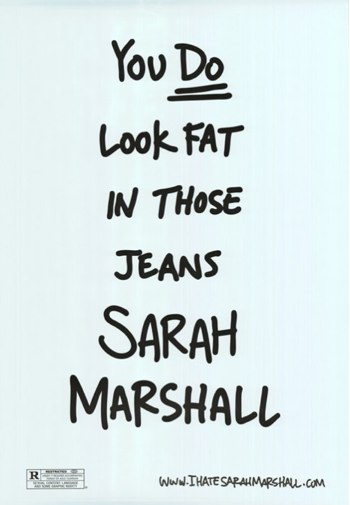
This poster for Forgetting Sarah Marshall, which probably sounded like a good idea at the time, is truly stupid. Seriously, it doesn’t repulse me like some of the posters below, but it’s genuine bad taste, and doesn’t really invite me to see the film. Words without pictures don’t make good film posters, either.
******************************
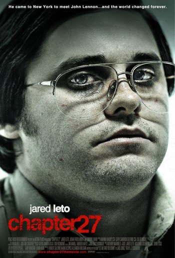
We think it’s something to do with losing weight? Or is it perhaps about dreadful 70’s glasses? Or perhaps, had you looked up the website, you’d have realised that it’s about the guy who murdered John Lennon. Poor Jared Leto: since Panic Room he’s done nothing of any quality. And this enormous head-shot of his overweight mug isn’t exactly thrilling either. Looks like a fun time in the picture theatre here, folks!!! NOT!!
********************
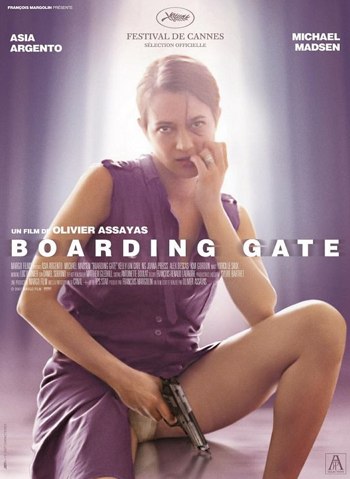
Astonishingly awful, almost pornographic, poster for a film, one that beggars belief at exactly what the point is. Asia Argento, who “starred” alongside Vin Deisel in xXx, and is the daughter of famed horror director Dario Argento, sits with her crotch showing and a gun in hand, underneath a title screaming “airport drama” or “hostage negotiator with a vagina”. Not sure what the point is, but the visual certainly distracts. No doubt a few teenage boys stopped to look as they walk past to see the latest Judd Apatow flick.
******************
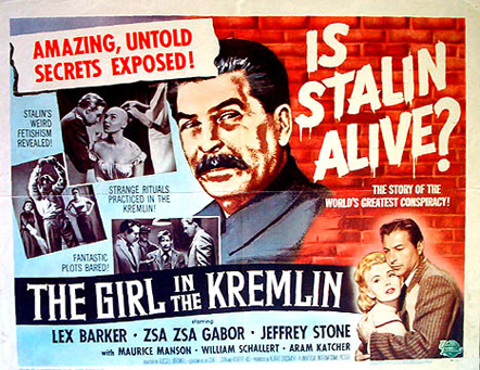
Okay, so this schlock piece is probably not the worst poster of the lot, but it does raise a laugh. Screaming the question to Communist-fearing America during the height of the cold war, this flick would only rate the barest of mentions for the fact that it has Zsa Zsa Gabor in it. Apart from that, and the dreadfully stupid plot points outlined within the poster (exactly what is that weird fetish of Stalins meant to be; bald people?) you couldn’t walk past this effort without raising a smile of amusement.
***********************

Here’s your task. Without checking out iMDB or Wikipedia, try and figure out what the hell this film is about just by the poster. Is it a horror film? A sci-fi epic. A weird spin-off of Dark City? Or a bizarre attempt to make tree roots scary? Either way, you’d have no idea just from this.
******************
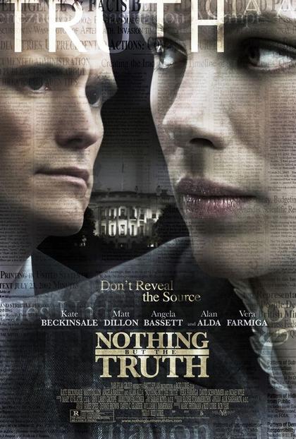
A jumbled mess of a poster that tells you a) nothing about the film, except that it’s set in Washington, and b) that guy from Crash is in it. Distracting, eye-wateringly crowded poster makes no sense whatsoever to the casual observer.
**************************
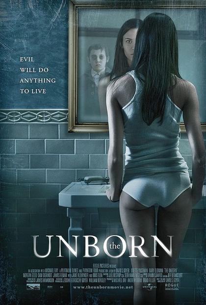
Okay, here’s the most stupid poster of the lot. A prime example of how not to make one. Now, those of you with testosterone would have first noticed the half naked woman in the picture, and forgotten about just about everything else. But the creepy dude in the mirror, the glowy Trajen Pro font and genuinely weird vibe of this poster don’t help you from being distracted by the knickers midway down. No doubt a film destined for people who enjoy casual horror/titilation, this film poster is a great example of a bad poster done well. Sorta. Sorry, I lost my train of thought. I was checking out that hot rump again.
********************
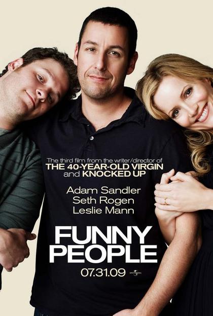
Okay, this is a fairly recent release, but the poster is plain old weird. It’s almost like some sort of family album shot, a kind of “hey, stand over there and I’ll take your picture” shot that screams amateur hour. And considering the talent and money involved in this film, you’d think a better poster would have been generated. Adam Sandler looks like he’s constipated in it, and the way Seth Rogen and Leslie Mann are leaning on him is just whack. probably not the greatest film poster ever made… no, strike that. Definitely not the best film poster ever made, and a great example of poor marketing. No doubt the film will still make bucket loads of money though, so I guess an el cheapo poster saved a few bucks.
**************************
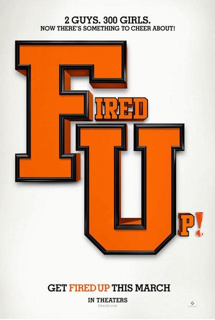
Okay, so we’ll simply get the title of the film, make it look cool with photoshop and some standard University Varsity font and that’ll get the punters in. Is this a football flick, a cooking flick, or perhaps an unemployment flick? No idea, and I doubt I’ll ever see it.
**********************
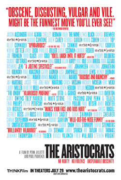
The film poster equivalent of an epileptic seizure, this poster for The Aristocrats is mind-numbingly awful to look at. Who’s in it? Whats the basic plot? Can’t tell from this painful-to-view poster.
********************

Allegedly the Polish poster for James Cameron’s Aliens from 1986, I’ve yet to read any evidence to the contrary. What on earth somebody was thinking about when they designed this, nobody knows. You wouldn’t even use this as an album cover for a punk-rock alternative band.
************************

Yep, I guess I know who it is, but what’s it about? Mia Farrow’s star has waned since the 70’s (if it ever shone at all!) and I’m gonna need a bucketload more info before I commit to something looking vaguely like an Amish Lifestyle Video.
*****************************
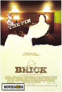
I’ve checked this poster out a dozen times now, and I still have no idea what the point is.
**********************

I think this has something to do with Scooby Doo. Not sure, just a feeling.
************************
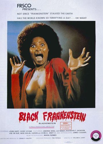
Okay, so it’s fairly obvious what the films about, but can you stop staring at the boobs on this chick? Nope, me neither.
**********************

Jewish insensitivity aside, this might have made a great film were it not for the fact that the cast appear to be murdering Nazi swine, and regardless of carefully placed insignia, doesn’t fill me with happy-joy-joy. Chicks with guns? Sure. Naked chicks with guns? Even better. Naked chicks working for Hitler with guns? If it’s a comedy, okay. If not, then no. And considering that most of the women in this poster are nude, I’d say “….In Uniform” is a prime example of false advertising.
***************************

Now, there’s probably a lot of blokes that wouldn’t mind doing this to Jessica Alba (And I am one of them) but this rip-off of John Lennon & Yoko Ono’s famous Rolling Stone cover picture screams, well, ripoff. Is Chuck supposed to be dry-humping Jessica Alba? Does he have a disease which prevents him from spooning correctly? Not sure, but no doubt you’ll see it to find out if Alba gets naked too.
*********************
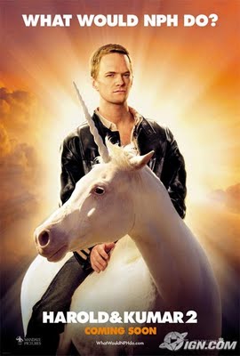
Doogie Howser riding a unicorn? Bizarre, strangely arousing, and yet, stupid. Just like the film.
*********************
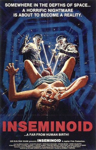
The fact that two astronauts are looking directly into the open womb of this horrified mother-to-be, while the tagline screams something about “depths of space”, reeks of inappropriateness. Still, with a name like Inseminoid, you’d be hard pressed to come up with something better!
**********************
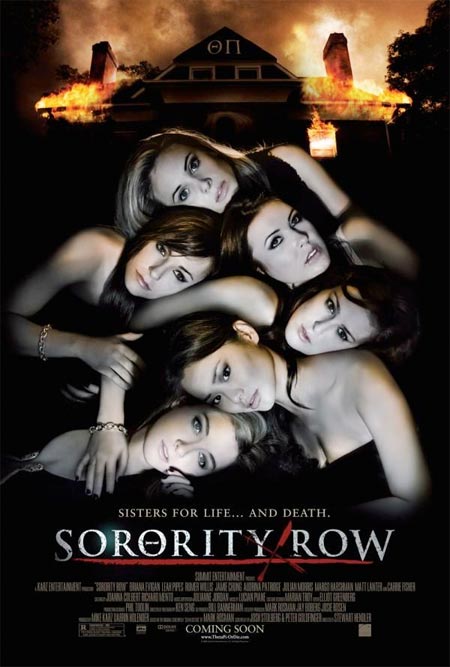
Hard to know what to make of it. I’d probably see it expecting some nudity, but it looks more like a cross between Scream and Coyote Ugly. Either that, or it’s a future glimpse at conjoined sextuplets pre-surgery.
********************
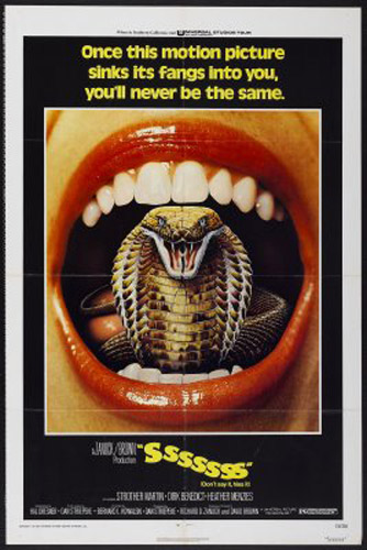
So it’s a film with snakes coming out of people’s moths? An advertisement for toothpaste involving the poison of a cobra? I guess it’s scary…. sorta….
*****************

Dumb. Just dumb. Let me ask you, would YOU see this?
*********************
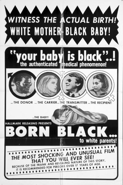
Possibly the single best movie poster we’ve ever seen here at fernbyfilms.com, and the last one for this years sampling. And, what do you know, it’s even presented by Hallmark, when you care enough to send the very best….. Born Black. Can’t wait to see it’s sequel. Born Chinese. Or even better, Born Retarded. Wait, wait, I have more……
*******************************************
So there you have it, the very best of the best shite we could scrounge up this year. If you feel like we’ve missed one, or you’ve perhaps stumbled upon a film poster you think we should include, feel free to let us know!
